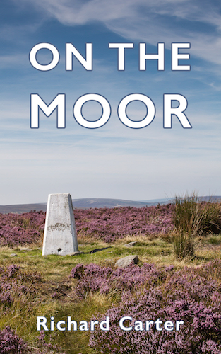
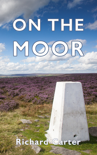
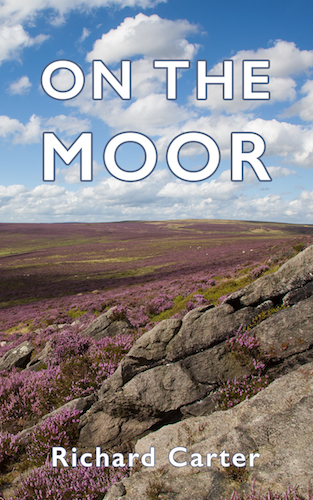
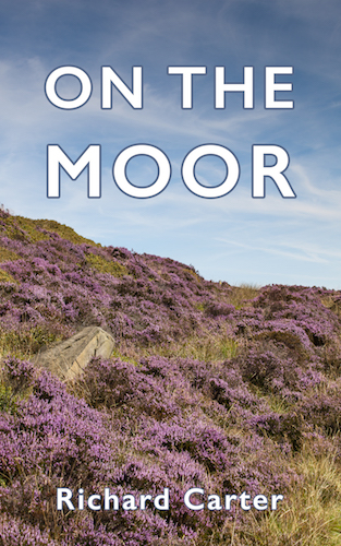
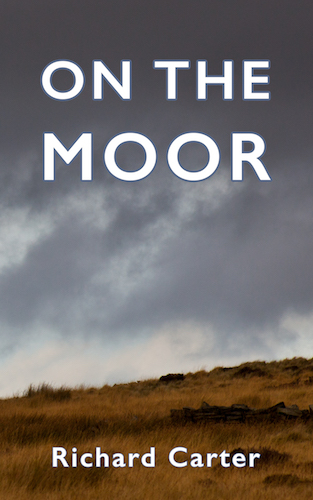
I’ve been experimenting with some different cover designs for On the Moor. I’d be interested in hearing any feedback you might have. The advice from Amazon is to use big text on the cover, so it can still be read when reduced to a minuscule thumbnail image in their store.
I don’t consider any of these potential covers to be finished yet, but I’ll be very interested to hear what you think. In particular, which, if any, of these covers might tempt you to take a peek inside the book to find out more?
Please feel free to leave your feedback in the comments below, or you can email me, or post comments on Facebook or Twitter.
Thanks.
Leave a Reply